
Select Language:
Top 5 Surprising Ways Maps Can Deceive Us in 2025
-
The Myth of Scale and Distance
Many people underestimate the true extent of distances on maps due to the way they are scaled and projected. A journey that appears short on a map can actually take hours or even days in real life. For example, a route spanning just a few inches on a standard map might correspond to hundreds of miles. This discrepancy often leads travelers to plan unrealistic itineraries, especially when navigating unfamiliar territories or remote areas. Despite advances in digital mapping, some distortions remain, reminding us that a map is always a simplification of the real world. -
The Mercator Projection’s Hidden Bias
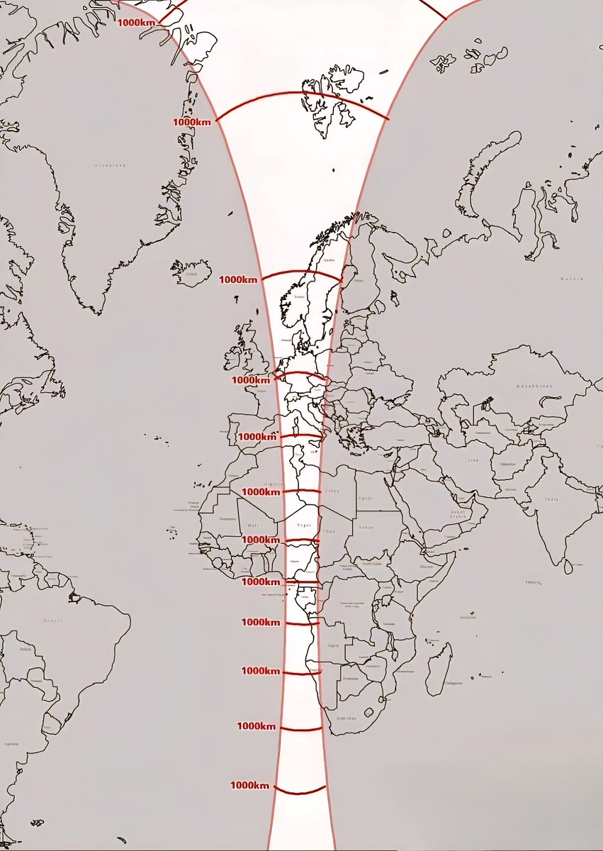
While the Mercator projection is popular for navigation, it significantly enlarges regions near the poles. Countries like Greenland and Canada appear far larger than they truly are in relation to equatorial regions. For instance, Greenland looks roughly the size of Africa on a Mercator map but is actually about 2.1 million square kilometers—much smaller than Africa’s 30 million square kilometers. This distortion influences perception and can foster misunderstandings about global geography, cultural significance, and even geopolitical importance. -
Why Map Distortions Matter in Climate Awareness
Climate change maps often exaggerate or minimize certain regions’ vulnerabilities because of projection distortions or the way data is presented. Coastal areas prone to sea level rise may seem less threatened due to map scaling, while others appear disproportionately affected. As climate maps become tools for policy and awareness, understanding the underlying distortions helps us better grasp the real risks facing communities around the world. Accurate geographic data is crucial in developing effective strategies to combat climate impacts. -
The Impact of Digital Mapping on Navigation and Perception
With the proliferation of GPS and digital maps, many rely heavily on real-time navigation tools. However, these tools can sometimes reinforce misconceptions by providing overly simplified routes or ignoring local geographical nuances. For example, satellite images and 3D mapping may portray an area as accessible or navigable when in reality, terrain or infrastructure limitations exist. Additionally, digital maps may not account for seasonal changes, construction, or natural events, leading to potentially unsafe or inefficient routes. -
Cultural Misunderstandings Fueled by Map Design
The way maps are styled and designed can inadvertently lead to cultural misunderstandings. Some maps emphasize politically claimed territories, which may dispute sovereignty or border definitions. Others may omit indigenous lands or minor islands, skewing perceptions of sovereignty or sovereignty disputes. These design choices influence global and local narratives, highlighting the importance of critical engagement with geographic information. As consumers of map data, recognizing these biases helps foster a more nuanced understanding of geopolitical realities.
In 2025, as technology advances and our understanding of maps deepens, it’s essential to remain aware of the ways in which cartography can shape perceptions of our world. Whether planning a trip, assessing climate risks, or understanding geopolitical conflicts, recognizing the limitations and distortions of maps empowers us to see the globe in a more informed and accurate light.
 ChatGPT
 Perplexity
 Gemini AI
 Grok AI