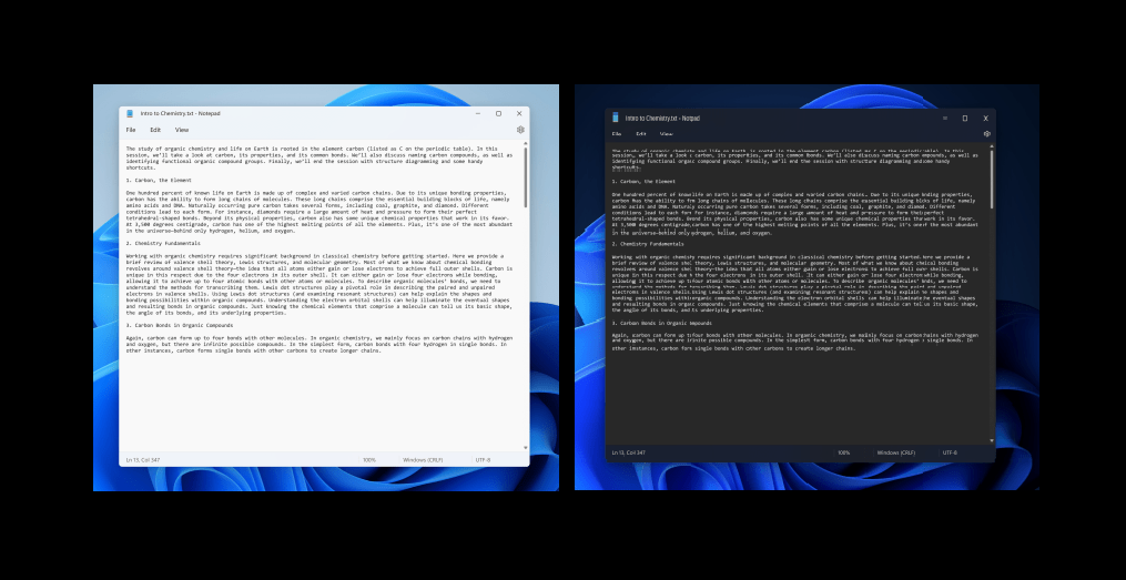
Users welcome the latest update rolled out, including the dark mode for notepad, new search/find/replace, and undo features, among others.
Microsoft is testing a redesign of the age-old Notepad app, which is limited to visual updates and has functional upgrades that will positively affect the users.
The tech giant has wisely added more minor, valuable updates to the app instead of taking it full of new features. Users can now utilize an updated right-click menu, improved search/find/replace interface, a better undo-feature, Windows’ theme-adopting material on top of the dark mode.
While the current version comes with two different pop-up windows and keyboard shortcuts for the text search tool and the find&replace tool, the redesigned version has combined them into a single floating bar, giving it a modern touch.
If like many others, you were previously annoyed by the undo system that only went one step back, there is reason to rejoice. The newer multi-step undo version has more memory, so it is a reasonable step up.
Another noticeable change is that Word Wrap resides in the View menu, and the Format menu has been discarded. The font button is a part of the Edit dropdown now. These small changes still seem to be a cohesive step from Microsoft, and users are expected to welcome them wholeheartedly.

The Notepad redesign version will be available for Windows 11 Insiders using the Dev channel. The test version of the Operating System usually doesn’t show the latest update, so if you can’t see it, chances are you need to check for an update in the Microsoft Store.
For the rest of the users, worry not; Microsoft will be rolling out this update for you, too, probably just after a little while. Like Photos and Paint, the company is keen on improving apps used in routine and some of the more unique products like Office, showing that Microsoft leaves no stone unturned in keeping its customer base engaged, for good.
