Google is refining its native applications on Android, and this time, the focus is on Google News. This update follows the major redesign of Google Maps that took place earlier this year. So, what changes can users expect in Google News?
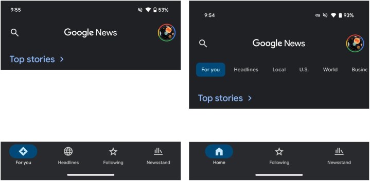
The revamped Google News simplifies the bottom navigation bar. Previously, there were four separate tabs: For You, Headlines, Following, and Newsstand. Now, the For You and Headlines have been merged into a new Home tab, which serves as the default content feed. The Following and Newsstand tabs remain unchanged.

A new categories carousel has been introduced along the top of the app, giving users access to categories such as: Headlines, Local, U.S., World, Business, Technology, Entertainment, Sports, Science, and Health. These categories were previously located within the Headlines section, and their new arrangement eliminates unnecessary navigation steps, enhancing the overall user experience.
When interacting with the category carousel, the selected feed now highlights the category instead of showing an underline. This improvement increases visibility, helping users easily identify their current feed. While one-handed accessibility remains unaffected, overall navigation has been made more intuitive.
Reducing the bottom navigation bar from four tabs to three is consistent with recent changes in other Google applications, such as Google Photos and Google Maps. This simplification not only enhances usability but also contributes to a cleaner, more elegant look aligned with Material You design principles.
The redesigned Google News is rolling out with version 5.120.x on Android via a server-side update. Although iOS users will have to wait for the new aesthetics to arrive, they should be seeing the update soon. However, for those who appreciate dynamic color theming on Android, it’s worth noting that this feature will not be present in the Google News redesign, as it continues to utilize a blue accent color.


